I think this went really well. I created this in Adobe Illustrator and used the colours to suit the artist which is Deadmau5. I chose to do this design on Deadmau5 because it was an artist that really interested me and i thought it would be interesting to try and design a google page.
This is the design sheet for the google outcome: http://sdcmoodle.southdowns.ac.uk/mod/resource/view.php?id=69854
Wednesday, 19 December 2012
Kate Moross
For this task we were told to create a CV in the style of Kate Moross. We were told to hand draw the design and then colour it in photo shop.
I am pleased with the outome. I tried to fit in all of the things i would put into a CV to make it interesting. I chose to make this image really full of things because the purpose of this is to do have done it in the style of Kate Moross. I created this in photo shop by colouring all the individual bits in with different colours.
Wednesday, 5 December 2012
Production Report
What is a serif font and San serif font?
In typography, serifs are semi-structural details on the ends of some of the strokes that make up letters and symbols.
San serif or simply sans typeface is one that does not have the small projecting features called "serifs" at the end of strokes.
Name a San serif font and a serif font?
Cambria is a San serif front. Curlz MT is a serif font.
What does CMYK and RGB stand for? Why are they different?
CMYK stands for "Cyan Magenta Yellow Black." These are the four basic colors used for printing color images. Unlike RGB (red, green, blue), which is used for creating images on your computer screen, CMYK colors are "subtractive." This means the colors get darker as you blend them together. Since RGB colors are used for light, not pigments, the colors grow brighter as you blend them or increase their intensity.
The following file formats are important within the industry. What do the following formats stand for and in what context would you use them?
JPEG- Joint Photographic Expert Group, best for emailing thing over because it compacts the file.
PDF-Portable Document Format, best for sending files to printers
GIF-Graphical Interchange Format, best for putting things on the web.
EPS-Encapsulated Post Script, high resolution file
PNG- Portable Network Graphics, saving from photoshop
Wednesday, 14 November 2012
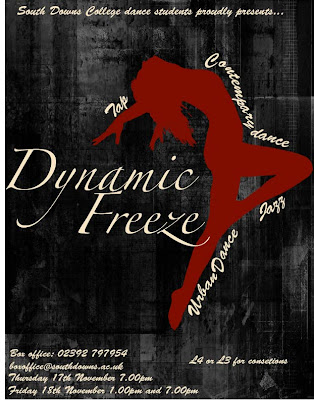
Dynamic freeze
The dynamic freeze poster i created was made in Adobe Illustrator CS6. I made different logos to find out which one would be the most effective for what i was doing, I did this by using different fonts
 This is my final poster. I used Zapfino font on all of the text used. All of the images i used from the internet. I think this project went well because i have learnt how to use the program properly and i have developed my ideas throughout.
 This is my final poster. I used Zapfino font on all of the text used. All of the images i used from the internet. I think this project went well because i have learnt how to use the program properly and i have developed my ideas throughout.
 Wednesday, 17 October 2012
Dynamic Freeze
To do all of these designs i used different fronts, sizes and colours. I added a couple of effects, this included using the warp effect and others. I was please with a couple of the outcomes and others i wasn't too please with because they didn't stand out enough.
Wednesday, 10 October 2012
Avatar
I made myself into an avatar by making the background blue to give everything a blue effect and i added the ears in and erased the edges to make it a bit more realistic.
Wednesday, 3 October 2012
Rolling stones
I got an original rolling stones image and i changed the image into 5 different colours... I then deleted some parts of the image to make it have different coloured stripes.
Terry Richardson
I made this celebrity (Terry Richardson) have more muscles around the arms and i elongated his chine and made his glasses a different shape. I also made his forehead a touch bigger.
Monkey
Photoshop
I chose a picture off the National Geographic website and uploaded it into photoshop. I then tried to change the picture in many different way as shown bellow. Some show more detail and some make the image look less detailed but more vibrant.
Wednesday, 26 September 2012
Cameras
Using InDesign i created this. I used Loren Ipsum for the text and changed that background to black and white by changing the gradient.
Wednesday, 19 September 2012
Subscribe to:
Comments (Atom)


